Welcome to the latest instalment of MLE Monthly Insight; an in-depth look behind the scenes at the different areas of MLE. In these articles we will look to give you, the community a peep behind the scenes, to see what’s happening and potentially what’s coming. With playoffs literally just around the corner it’s been a busy time behind the scenes so what’s been going on? Let’s find out…
Community
With franchise logo reveals now well underway, there were two community surveys published to gauge community reaction to 10 of the revealed logos. We received a decent number of responses to both surveys, though the more feedback we get the better perspective we have of community opinion. Generally the consensus on the logos revealed so far has been positive, with a few caveats, which we will touch upon.
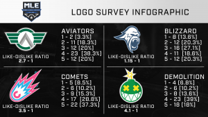
So how were the last 10 logos revealed received?
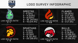
From the infographic there’s clearly one “anomaly” in comparison to the rest of the logos. The Spectre, Spartans and Bulls logos were all well received, with strong positive like to dislike ratios. In particular the Spartans, which no one ranked below 3. The only main criticism of the Spartans logo was the “mane”, which some people felt went too far around the helmet. The Bulls logo received a fair amount of praise for its shading and use of colours but there was some uncertainty regarding the “white circle backdrop”. The Spectre logo was commended for its design and use of colours though there were some who felt a different design would have suited the franchise more.
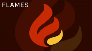
The one “anomaly” in the pack was the Flames logo. Before the logo was revealed we had a hunch that the logo may divide opinion due to it’s relatively minimalistic nature. It appears from the feedback that the simplicity of the logo was the main criticism, with lack of shading and detail cited. It’s clear the logo didn’t meet a number of people’s expectations and we are reviewing the possibility of changes.
The Eclipse, Hawks, Hive and Wizards also had their logos revealed this past month, let’s see what the community had to say about them?
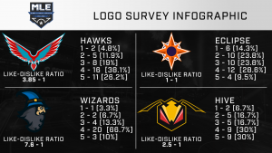
As with the previous four logos the reception was generally positive. The Hawks logo was complimented for its design and detail with people stating the Hawk looked fierce and aggressive. One of the main points of contention raised was the general size/proportion of the logo due to its width. The Wizards logo, with a like to dislike ratio of 7.6 to 1, was praised for its general design and its “relatability” to the franchise. A few people felt the secondary colour of the franchise, yellow, could have been incorporated more into the logo. The Hive divided opinion somewhat, with the design being the focal point for divide in opinion. A number of people liked the angular design and sharp edges but there was some criticism of the use of red in the logo. Lastly the Eclipse is one that has split opinion right down the middle with a 1-1 like to dislike ratio. Majority of people felt the colour scheme gave the logo a clean and bold look. The main issue a number of people had was with association and relatability. A portion of people felt the logo didn’t symbolise what they expect when thinking of Eclipse.
Lastly the Sabres and Express also received new logos…
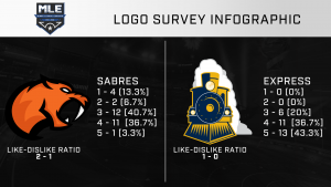
The Express received the honour of joining the Spartans in receiving no “dislikes” (i.e. a rating of 1 or 2). The main compliments of the logo were the level detail of the use of colours. There was a proportion of people who felt the steam wasn’t necessary or could be reduced but there were no common complaints regarding the logo. The Sabres was also generally well received, with people liking the general design however there was a common theme regarding certain changes such as incorporating white fur to increase association with Sabretooth tigers. The nose was also a contentious point of the design, with a proportion of people feeling it didn’t look right.
Overall the feedback to logos has been generally positive so far. We will discuss the design of each logo a little bit more in-depth in the media section. As many in the community will be aware after recent discussions and a community poll, we have decided to change tact in terms of revealing logos. We had been revealing a few each week on stream. However with playoffs starting next week (9th May) there was a desire, especially from a Broadcast perspective, to have all the franchise logos ready to use come the start of the playoffs. With this in mind we will be broadcasting a special reveal stream this Friday (time tbc) on the MLE Network.
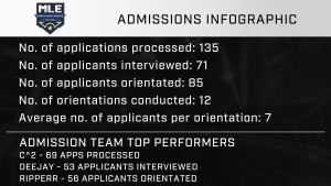
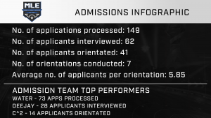
Of course the Community the team has been busy elsewhere. Admissions continue to run smoothly and the team are gearing up for the inevitable increase in applications that come with the playoffs. Below are admissions stats for the month of April. Big GGs to the admissions team for bringing in fresh meat to the community!
Recently, the Events team has still been attempting to rebuild and improve event player numbers. The team are planning on utilizing the off-season survey to hear community suggestions on the future of MLE Events. Two events are currently being planned for the playoffs. The first is another Crew Battles event and we hope to put on a Call of Duty Warzone competition event. More info on these will be released soon. The team are confident that with the feedback from the community on this seasons off-season survey that they can bring enjoyable events for everyone.
The Power Rankings Committee, with the assistance of a couple of community members, are working on a community feature to be run during the playoffs. The feature is hoped to bring an extra level of interest and engagement into every playoff series. More details will be released this week once the idea has been finalised.
LEAGUE OPERATIONS
It’s been largely business as usual for League Operations this past month, ensuring things run smoothly and rules around league play are enforced appropriately. Focus obviously has now turned to playoffs and ensuring everything is set from a League Operations perspective. The League Ops team have compiled a Playoff document that will provide useful information for players and teams. This will be released within the next day.
BROADCAST
It’s been exciting times in the Broadcast department. As the team start to get pumped up for the playoffs, there have been several improvements to Broadcast operations and output. Behind the scenes we have recently invested in VMIX. VMIX allows for greater flexibility and efficiency when it comes to running broadcasts and will allow us to take our broadcasts to new heights. This investment wouldn’t have been possible without the support of our great community!
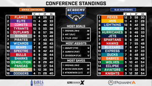
On screen you will hopefully have been seeing some of the improvements the team have been working on. One in particular we are very happy with is the implementation of player stats during series. See the clip below from the Blizzard vs Hurricanes Foundation League series to see it in action!
The Broadcast team are continually working to implement extra features that improve the quality and presentation of streams. There’s lots more in-store for broadcasts for the future! The team feel there have great strides made this season and there are some “massive projects” in the works for next season.
In the nearer future Broadcast are working with Media team to ensure all franchise logos are incorporated into assets for the playoffs. Don’t forget we will have a special stream this Friday showing off the remaining logos yet to be revealed!
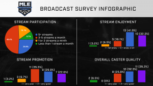
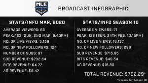
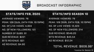
We hope these improvements will create greater engagement with streams and in tandem, increase viewing figures. There was a small increase in viewing figures during April compared to previous months. We hit a new peak for maximum viewers for the season and the average number of viewers for the month was up on the seasonal average.
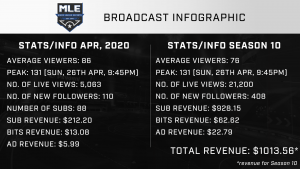
Those figures don’t take into account the week 10 viewing figures, which saw a strong increase in viewing figures, with a new peak viewership achieved of 225 and an average viewing figures of well above 100 for the weekend. These figures also don’t take into account those who tuned into mlesportsgg2 over the weekend. Broadcast hope to utilise mlesportsgg2 much more frequently next season. We would like to take this moment to thank everyone for their support by tuning into streams, the support has been amazing!
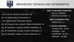
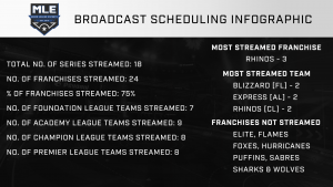
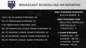
Lastly here’s a look at some of the scheduling distribution stats. These stats include week 10 streams. All franchises were broadcasted at least once, with 27 out of the 32 franchises broadcast at least 3 times during the season. In total, 70.31% of teams were broadcast this season. We are relatively happy with the spread over the course of the season but realise there are a few gaps. We are looking to make significant changes to scheduling and series distribution for next season to allow for a more “even spread”.
And lastly, while Broadcast is focused on providing the best experience possible during the playoffs, the wheels are already in motion for Season 11. The team are always on the look out for new talent and support. If you fancy our hand at casting or broadcasting or perhaps supporting the team behind the scenes, feel free to reach out to one of the Broadcast “heads” about getting involved. The team are committed to supporting and developing talent, so don’t worry if you haven’t had much experience.
MEDIA
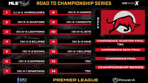
With the regular season drawing to conclusion the media team have been concentrating majority of their effort on playoff assets. We are looking to make this Seasons playoffs the “best looking” yet and a number of assets are currently in production that will be revealed on streams, website, social media, etc. over the course of the playoffs. To wet your appetites and provide a sneak peek, check the tab below here for a preview of “Road to Champion Series” graphic. These graphics will show each team in the playoffs “route” to the playoffs… and maybe Championship Series!
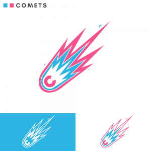
As promised, let’s take a deeper dive into the recently revealed franchise logos mentioned earlier. Our objective with the franchise logos was for a relatively clean style that erred more to a relative simplistic but focused look. One that would give each franchise a clear and unique image but one that fit in with the overall presentation of MLE.
In last months insight we went into some detail regards Spectre and Flames logo. Our own opinions and thoughts regarding Spectre logo have not changed and the feedback from the survey cemented those thoughts. The Flames however has seen a fair amount of discussion since the release and reception of the feedback from surveys. While we generally don’t want to make any drastic changes to many if any of the logos revealed we are not wholly opposed to changes if we feel necessary. Based on the feedback of the Flames logo we are looking into possible changes, however at this moment there is nothing concrete to announce.
The Spartans logo was pretty much an instantaneous hit upon first reveal. The design we felt while immediately obvious, was strong and bold. The logo did undergo one small alteration before being finalised to the logo that was revealed to the community. In the first draft of the logo the mane had a white “tip” that curved around part of top of the main. We felt this detail wasn’t necessary and also the extra colour didn’t fit with the overall design of the logo.
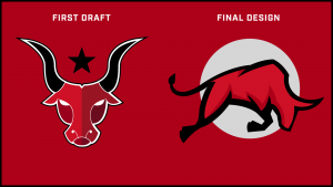
The Bulls logo was one logo that actually underwent a major redesign. The first draft of the logo was a “head on shot” of a Bulls head. While the logo wasn’t bad it was generally perceived to be not in keeping with our design and presentation objectives and requirements. One of the main criticisms was it felt a bit generic and aped a “Texan” aesthetic. The designer went back to the drawing board and came up with the current design, which met our expectations. One aspect we really like and think is key a component of the new logo is the sense of motion/charging, making it more dynamic than the previous design.
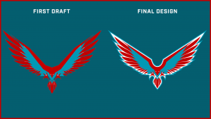
The Hawks logo underwent a few changes from its first draft. Those changes being the inclusion of white (the white eyes in the first draft are actually transparent) and the double outline. We felt the outline and the inclusion of white gave the logo more pop, helping to define its features such as the feathers and talons. These changes we felt improved the logo considerably. There were some concerns on the size, particularly the width of the logo however we feel it can be incorporated into MLE. This logo is one that has grown on TheGamingBear (President of MLE) considerably over time, “fun fact” for you there!
Despite the Eclipse logo receiving mixed feedback, upon being revealed by the designer it was well received. We particularly liked the themes and feel of an Eclipse were present in the logo without being too obvious. While we know the design has split opinion in the community we feel over time a number of people will become more accustomed to it. We expect this to happen with a few of the logos. As they start to be incorporated into the league people will start to associate and relate them to the franchises over time.
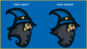
The Wizards logo didn’t undergo much change from first draft to final design, with the only change being made in the beard department. The first draft had more “curly” elements to it, which was something we felt didn’t quite look right and the beard was made much smoother and fuller.
The Hive logo made an instant impression on us when first shown by the designer. We felt the design was bold and striking. One element we particularly liked about the Hive logo was the somewhat “honeycomb” inspired outline. There wasn’t really anything we felt needed changing with the Hive logo so the design that was revealed was in fact the first iteration of the design shown to us.
The Sabres logo didn’t undergo any revisions from its first draft. There were some concerns regarding the nose however we felt it gave a “snarling”, fierce look to the logo.
The Express logo did undergo a few changes from its first draft. We felt the first draft provided a good foundation to develop the logo a bit further. We felt the inclusion of steam gave the logo more depth and identity, whilst changing the outline colour gave the logo more definition. Lastly we felt the train element of the logo was a bit too “wide and short” and the shape was adjusted to it’s final design.
MARKETING
In the Marketing department, work has been ongoing to improve promotion on Social Media. It’s likely we will be looking for additional support in this area over the playoffs. Keep your eyes peeled for an announcement.
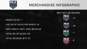
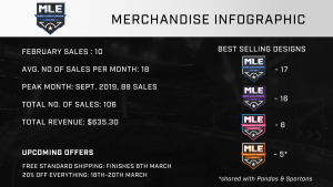
We will be looking to reinvest some of the revenue generated from different streams (merch, Twitch, etc.) into advertising and promotion going forward, as we feel it will help increase the exposure of MLE.
With the upcoming reveal of the remaining franchise logos, preparation is well underway to incorporate all the franchise logos on the store. All being well products will be available soon after the reveals. We know there has been a continuous interest in jerseys and this is something we are continuing to explore. It’s important we find the right supplier and distributor for such a product therefore it will likely take sometime before we come to a decision, most likely at least a few months. We can’t give any definitive time frames but we are committed to making it happen.
SPONSORSHIP
Not too much to report from a Sponsorship perspective, the team are settling under new guidance from Mobgaz. Emphasis right now is on reaching out to potential sponsors whilst maintaining existing sponsorship relationships. Don’t forget you can get free shipping on any order of BAWLS Guarana by using the promo code “MLE”. Perfect for some refreshment during the playoffs!
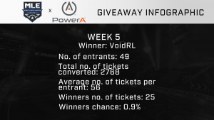
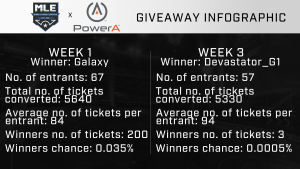
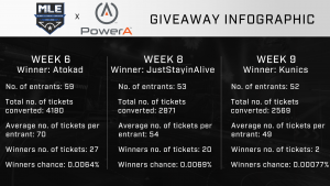
We had 3 community PowerA giveaways last month! Each lucky winner the recipient of a Spectra Enhanced Wired controller courtesy of our friends at PowerA. Check out the stats from each giveaway below!
WEBSITE
Over the past month the development team has been working closely with our broadcasting team to brighten up the scoreboard. By using the endpoints available from the website, we can pull in franchise and player data directly into the broadcast. SimpleAOB has been working on a robust control-board application for our casters. The team has also been working on a “Playoffs landing page”. Stay tuned for an announcement later this week. Looking further down the road, the team plan to add player’s salary, rank and other data to each profile.
ANY OTHER BUSINESS
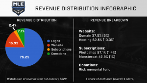
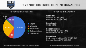
April saw a large amount of investment into MLE, most notably the final payments for franchise logos as well as a sizeable investment for broadcast. We are committed to ensuring revenue generated through Twitch, Patreon and merch is reinvested back into the league that improves the quality of our output and also benefits the community as a whole. Now that franchise logos are complete we can focus on other areas such as broadcast, where we can reinvest revenue. The infographic below shows the distribution of revenue reinvested for the season so far.
And that concludes the Monthly Insight for April! It’s been a busy month behind the scenes. We hope you have enjoyed this insight behind the scenes. We strive to make them as informative and interesting as possible. If there is anything you would like to see or hear about please feel free to send your suggestions via the usual formats.
As we enter the Playoffs and concluding weeks of the Season, the excitement grows and we can’t wait to finish the season with a bang! There’s lots in store and we wish all those competing in the playoffs the best of luck. And to those teams and players that didn’t make it we hope you enjoyed the season regardless and are itching for Season 11 to come around. So folks, fasten your seatbelts and enjoy the ride! It’s destination Season 10 Playoffs!
Thanks for reading,
from everyone at Minor League Esports


